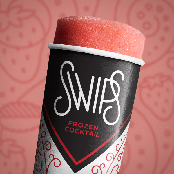
Swips, Frozen Coctails – Packaging
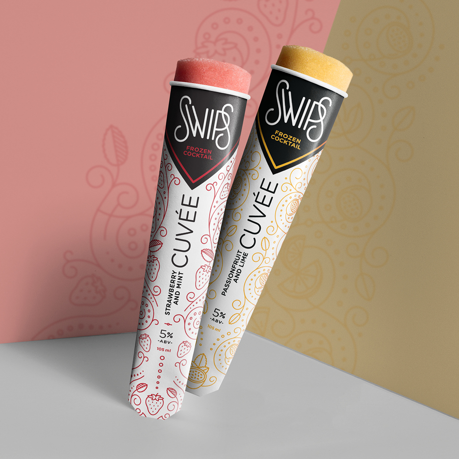
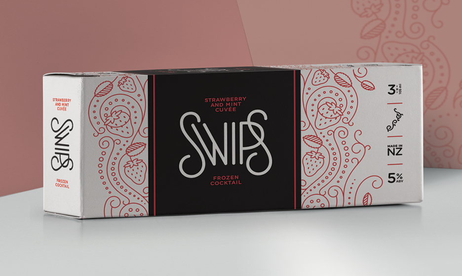
Client: Swips, Frozen Cocktails Agency: Simon Byers Design, NZ Background: In 2004, the founder of Swips was working at a bar in Hamburg, Germany. One night she left a strawberry margarita in a freezer due to a doubled up order. On discovering it later than night, she discovered it tasted even better this way! The concept for Swips was born. The challenge: The name ‘Swips’ translates from German as ‘a bit tipsy’. The brand needed to be visually sophisticated to appeal to an adult market, but also have the ability to show off its playful side. The direction: Drawing on the decadent aesthetic of the 1920s, the simple but elegant logo is offset with a lace-like pattern that is reminiscent of a stocking with suspenders – revealing a little, and promising more!