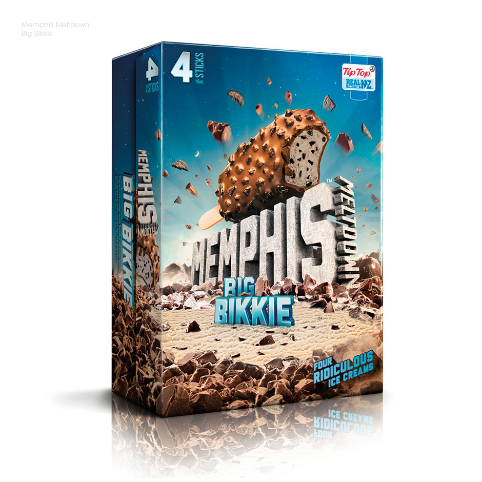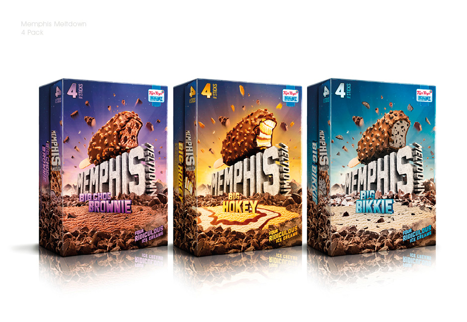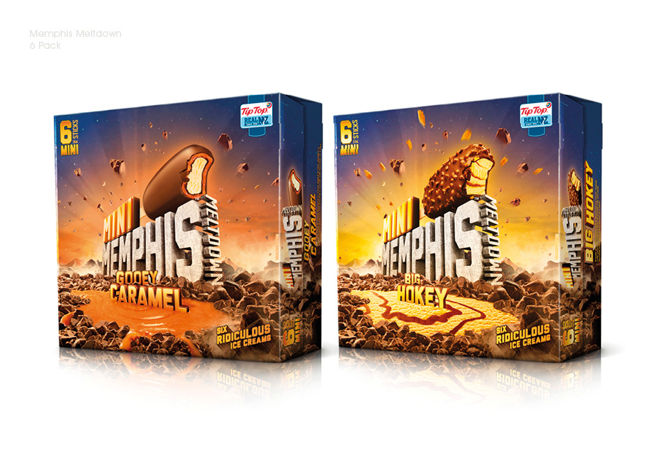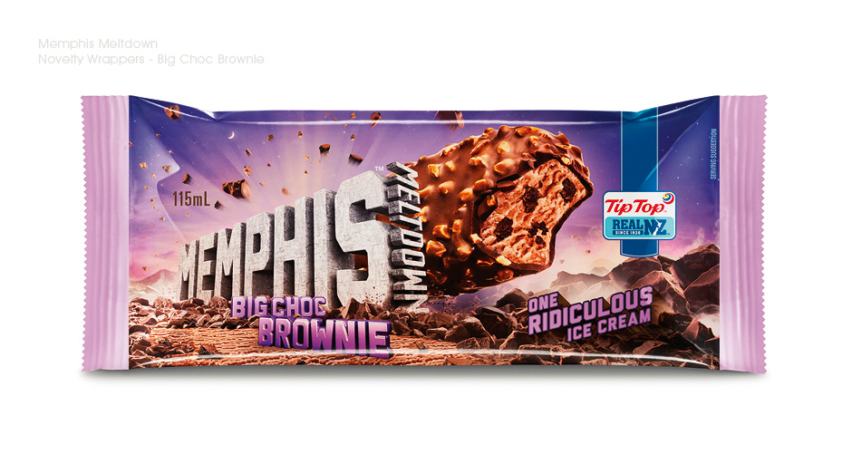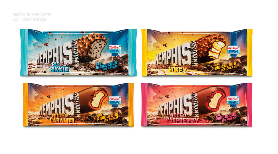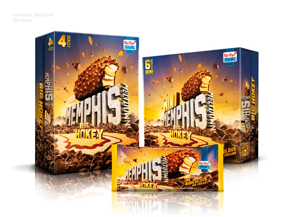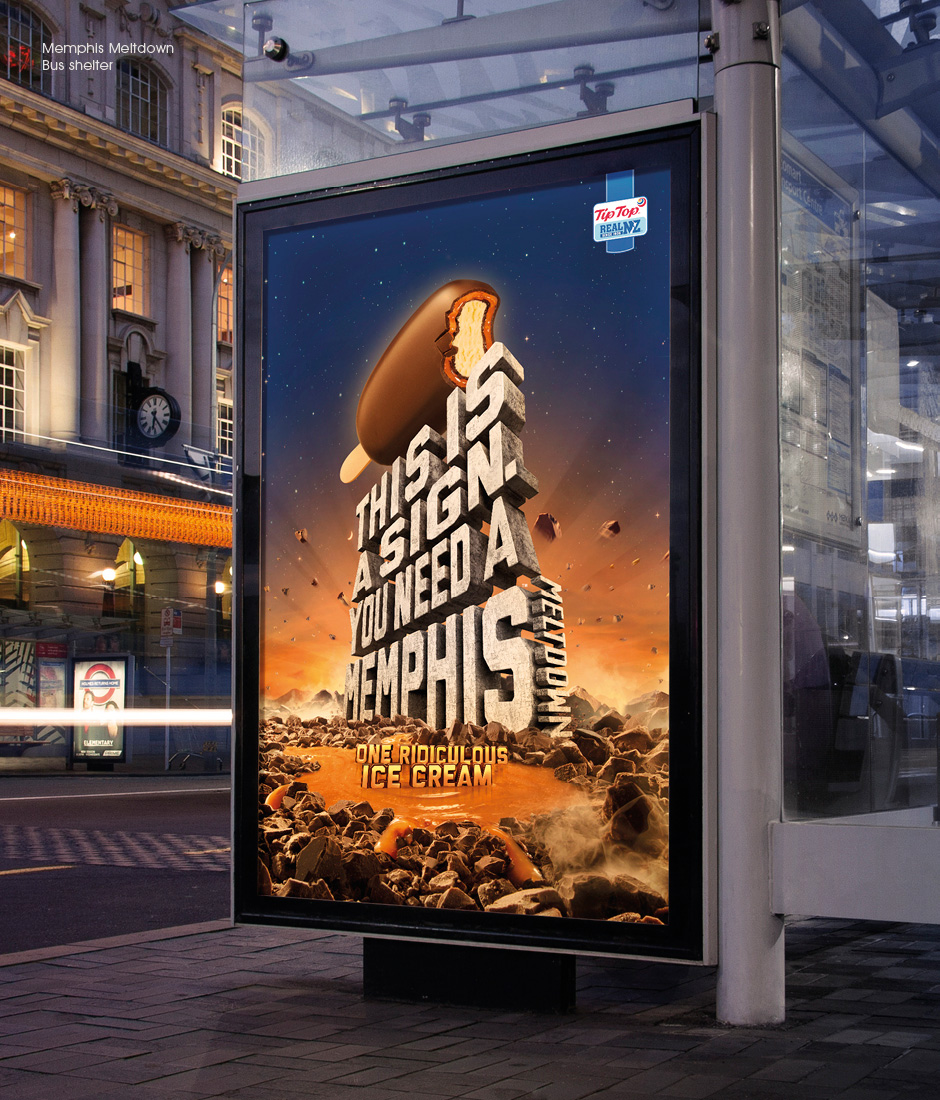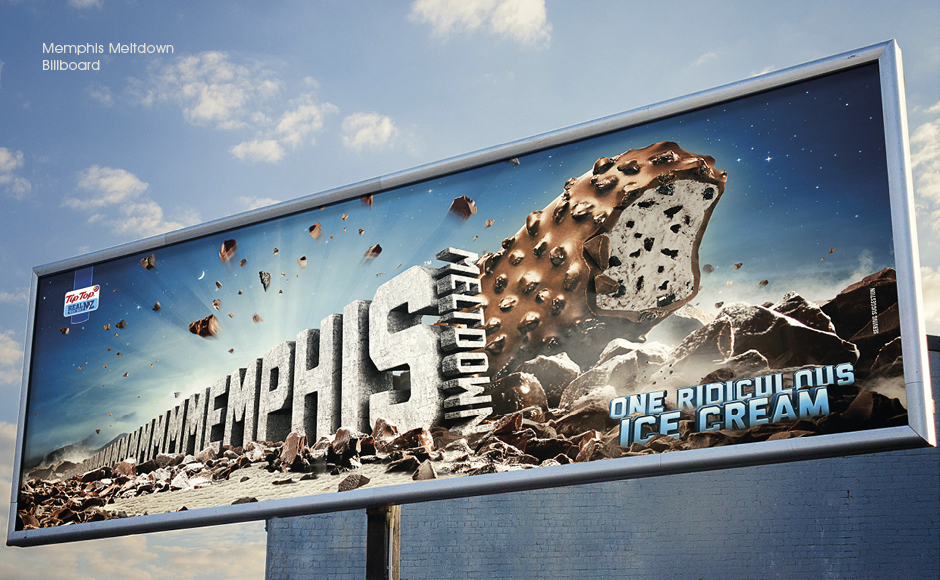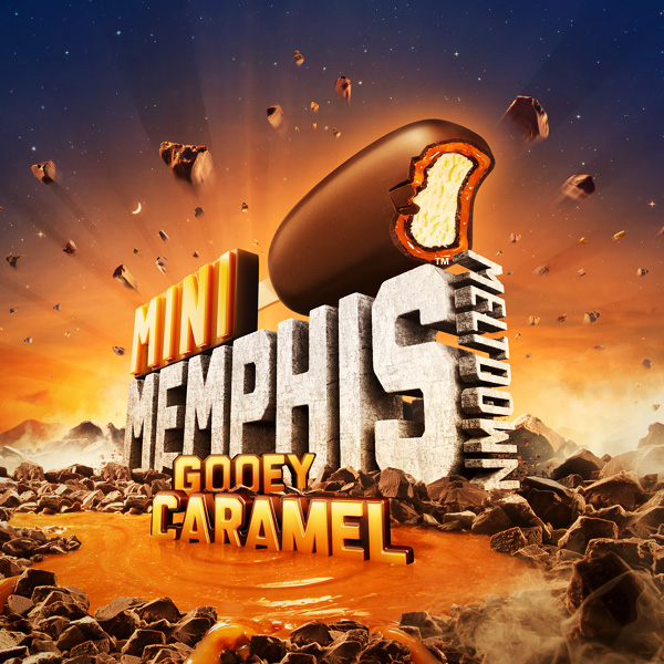
Memphis Meltdown – Packaging
Client: Tip Top Agency: Interbrand, NZ Brief: To become more relevant to the target market and make its brand as desirable as its products, Memphis Meltdown needed to reposition again to drive consumer love for the brand. To address this challenge, we designed a range of packaging for Memphis Meltdown that would fuel the “Memphis Crave” and convey the big proportions and excessively decadent nature of the product. We created an out-of-this-world land of Memphis, full of chocolate and big, chunky inclusions of biscuit, nuts and brownie. The “bigger than Ben Hur” logo evokes a strength and solidness that appeals to men who want a satisfying ice cream snack that’s extra-large, extra-manly and loaded with flavor.